The challenge
I tasked myself with the challenge to re-build and re-architect Bright's design system from the ground up. The goal was to create a system that was flexible, scalable, and consistent across all products, while also being easy to use for designers and engineers alike.
Problems
Our design process wasn’t broken, but the design system had some flaws.
- Fragmented systems - Each project had its own lightweight design system, used in isolation for product specific elements.
- Inconsistent outputs - Designers working in isolation produced mismatched results in colors, spacing, and component anatomy.
- Inefficient workflows - Without shared foundations, maintainability and scalability across product was impossible.
- Reinventing components - Designers repeatedly detached components and made changes as needed.
- Missed opportunities for reuse - Components that could have been shared across projects stayed in isolated design files.
- Lack of governance - Without a shared system, there was no way to enforce consistency or quality across products.
- Out dated design - The design system did align with Bright's recent rebrand, and the UI felt dated and inconsistent with the brand's new identity.
Current state
I identified a few common issues with the existing design system that needed to be addressed in the rebuild:
Styles
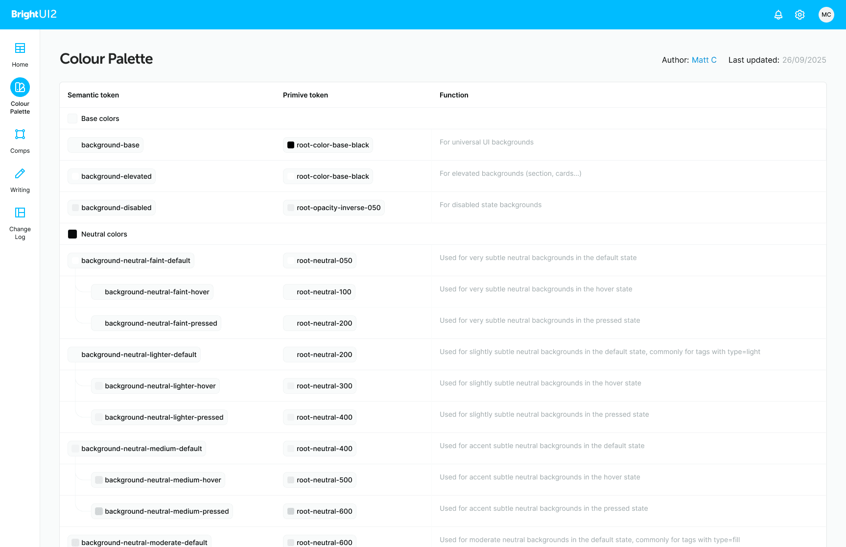
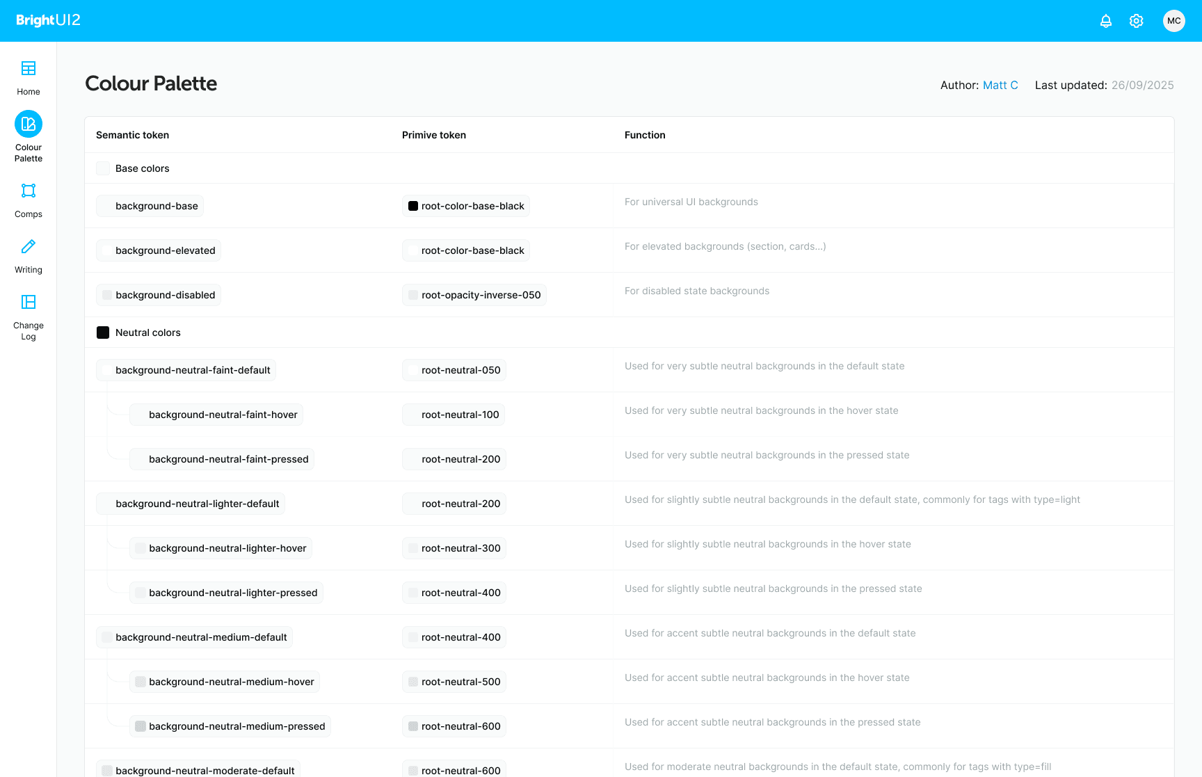
Every design tokens was using its primative value, this meaning that components were using them everywhere as well. 'Primary Button' fill didn't have a descriptive name, it just used 'Bright-Blue-04'. By usign this approach there was too much ambiguity with Designers, Engineers and QA.
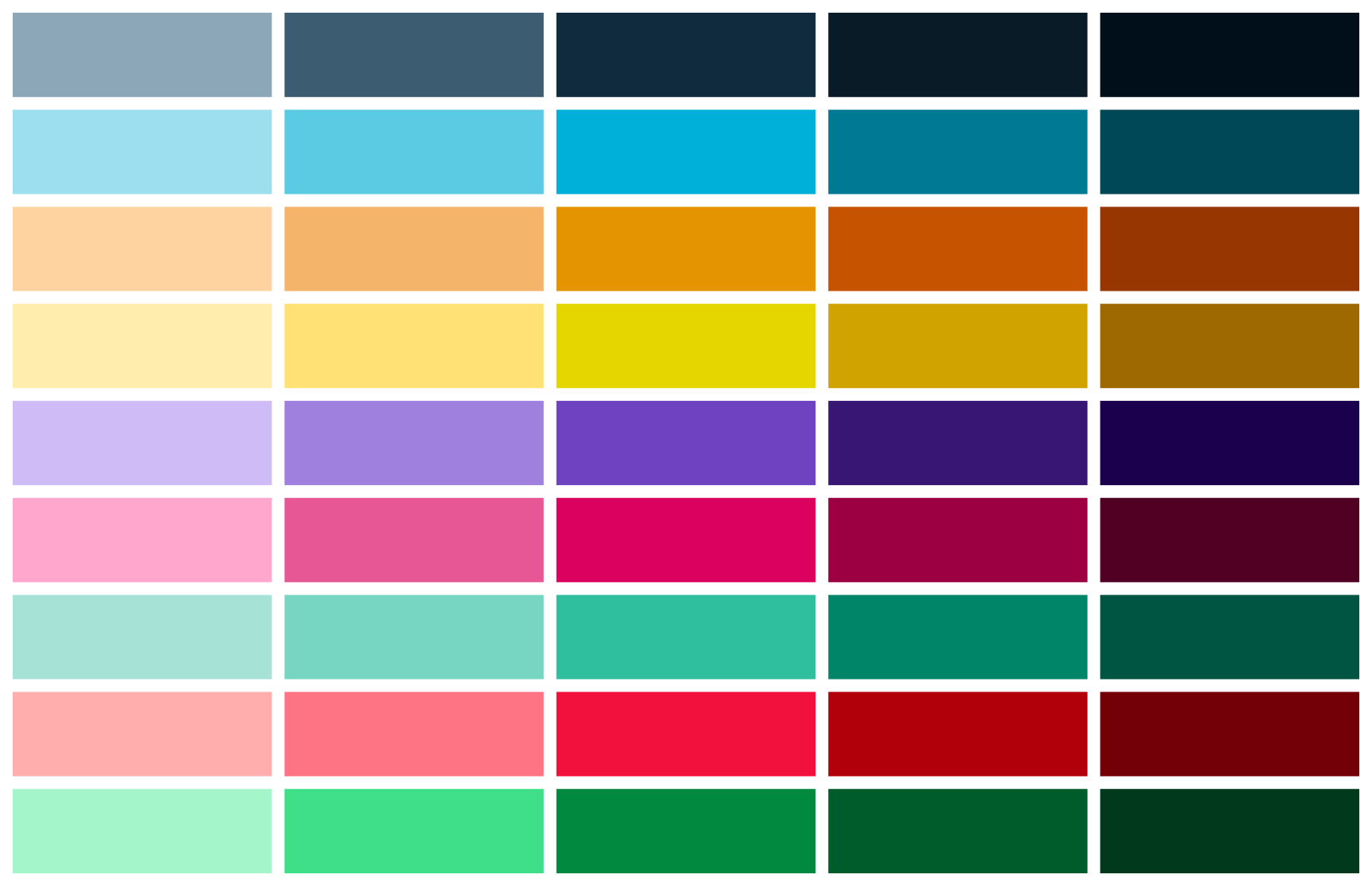
The colour palette was designed to be accessibility compliant, but the colours felt muted and dated. The palette was also inconsistent, with some colours being used in multiple places, while others were not being used at all.
Component architecture
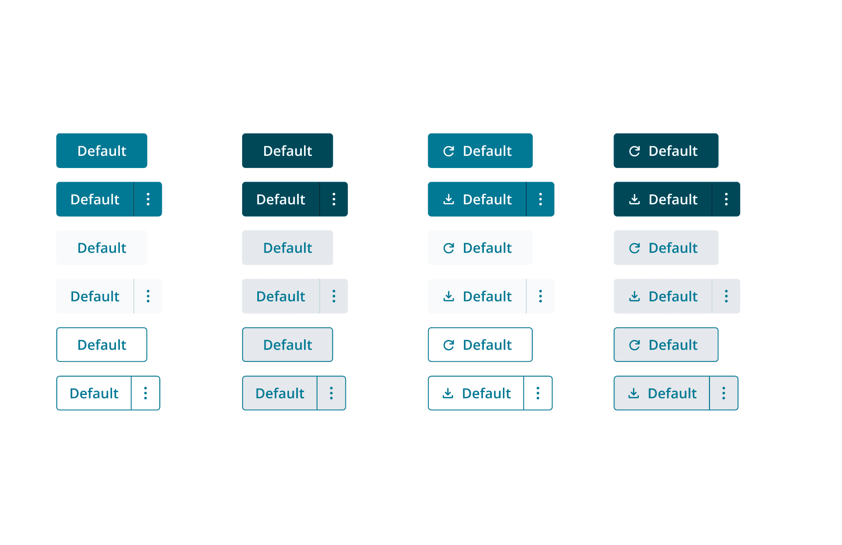
Every component was static and every props was just a variant switch. To put this problem into context, the button component had 6 design variants, and 360 variants in total. All of these could have been reduced by adding props to hide, show and change specific elements within the button blueprint.
Getting started
The plan wasn't to just rebuild the system, but to re-architect it from the ground up, it wasn't possible to just patch the existing system, it needed to be rebuilt. I started by creating a new variable structure that was more flexible and easier to use, while also being compatible with the existing design system.
Colour palette
I carefully curated a set of colours that keeps the existing colours palettes default values as the base, with 5 tints and shades either side of the base colour. This allows for a more flexible and consistent colour palette across all products, making the experience more cohesive and visually appealing, 'delivering the brightest experience'.
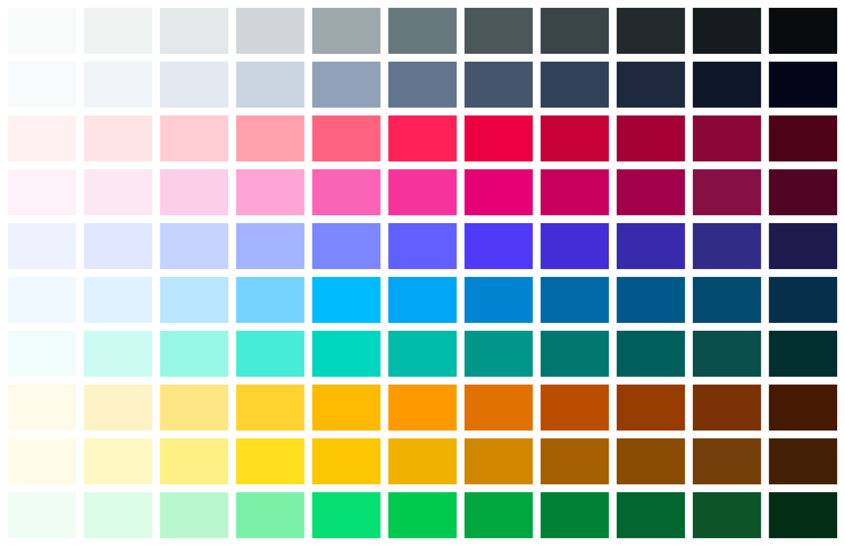
Accessibility was a key consideration in the design of the new colour palette. I ensured that all colours met WCAG 2.1 AA standards for contrast, and I also created a set of colour variables that could be used to create accessible colour combinations.
Variables structure
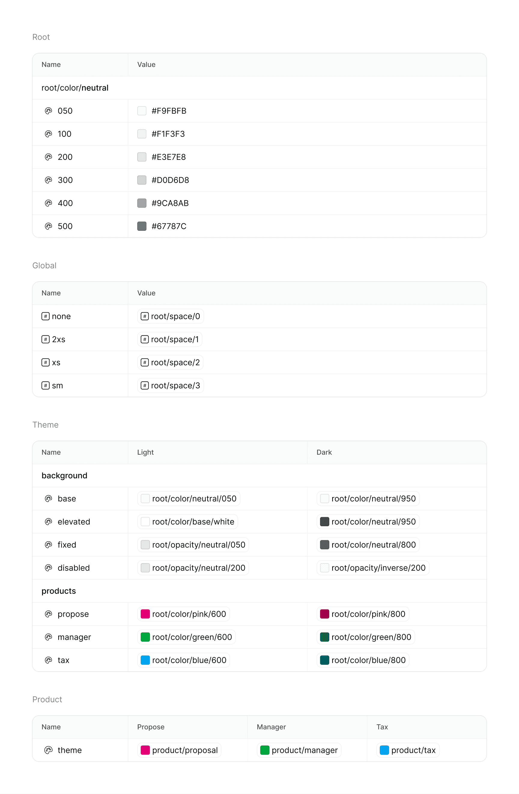
The variable structure was the biggest element of the new design system. I created a new variable structure that was more flexible and easier to use. The new variable structure allowed for future growth and scalability.
Font eligibility
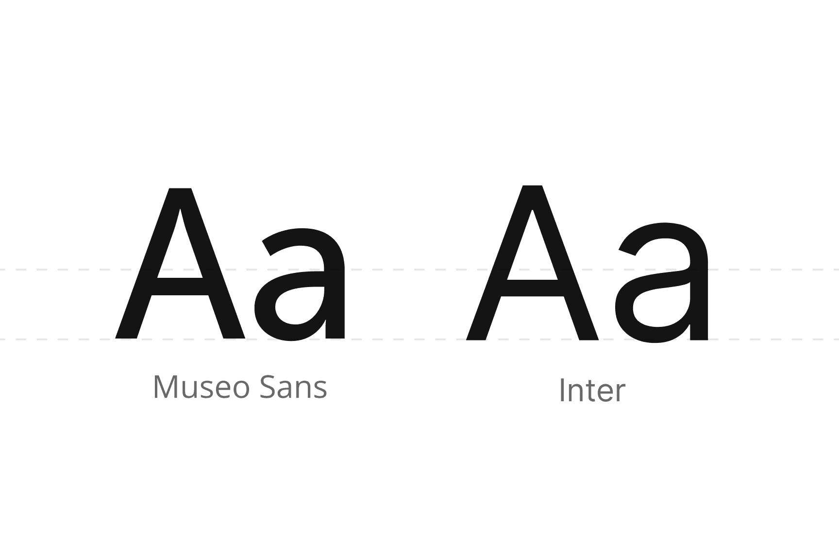
Bright's brand font is Museo Sans and is used across their website and marketing materials. Open Sans was used in the UI, but it didn't compliment Museo Sans and the UI felt extremely dated. I swapped out the font for Inter, it made the interface sharper and the character eligibility even better.
Using major thirds as the type scale, I created a new set of text styles that were more flexible and easier to use. The new text styles allowed for future growth and scalability.
Components
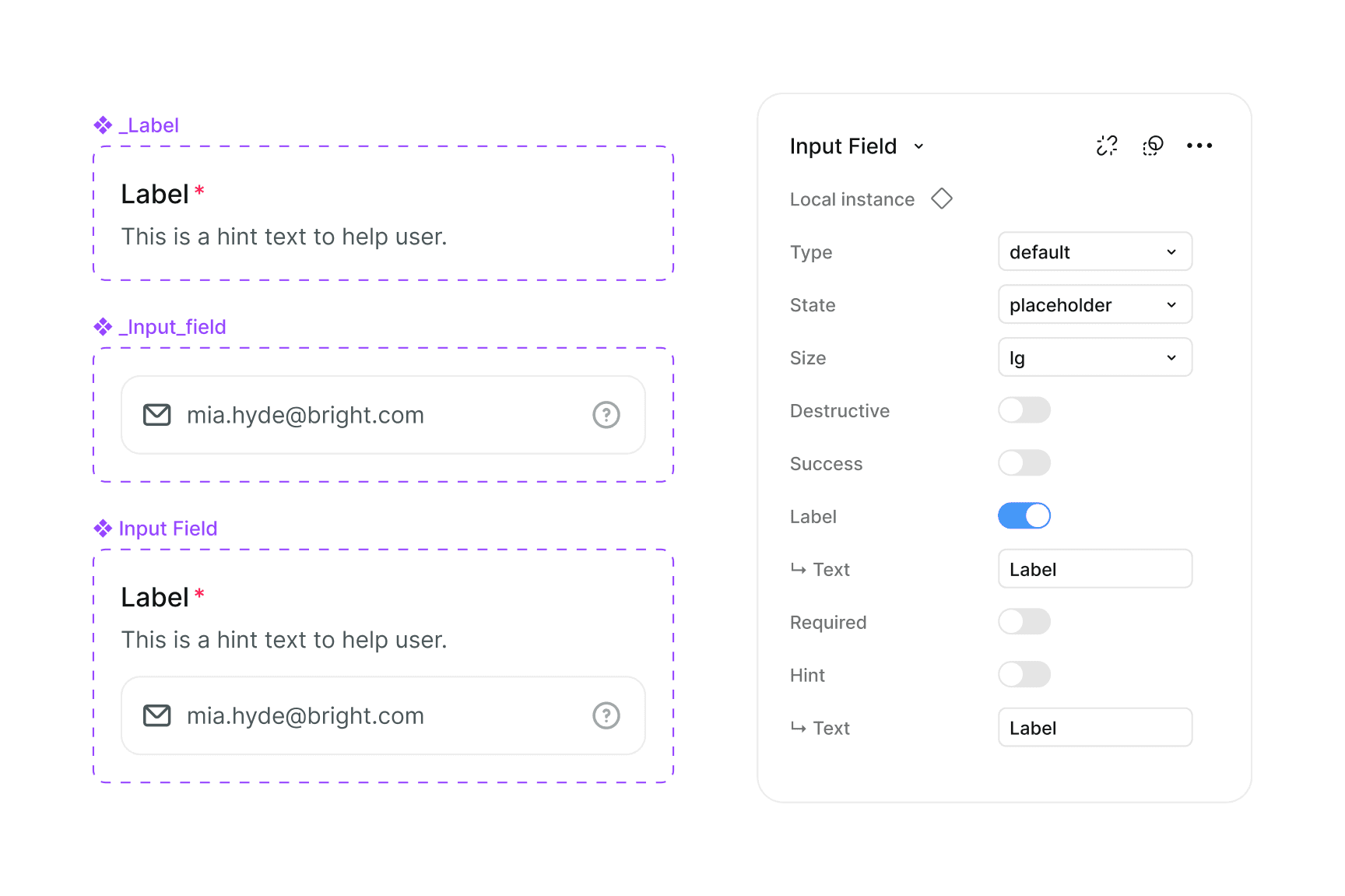
All components were re-architected to be more flexible and reusable. I created a blueprint for each component, which allowed for a more modular approach to building components. This meant that components could be combined and reused in different contexts, without having to create new components from scratch.
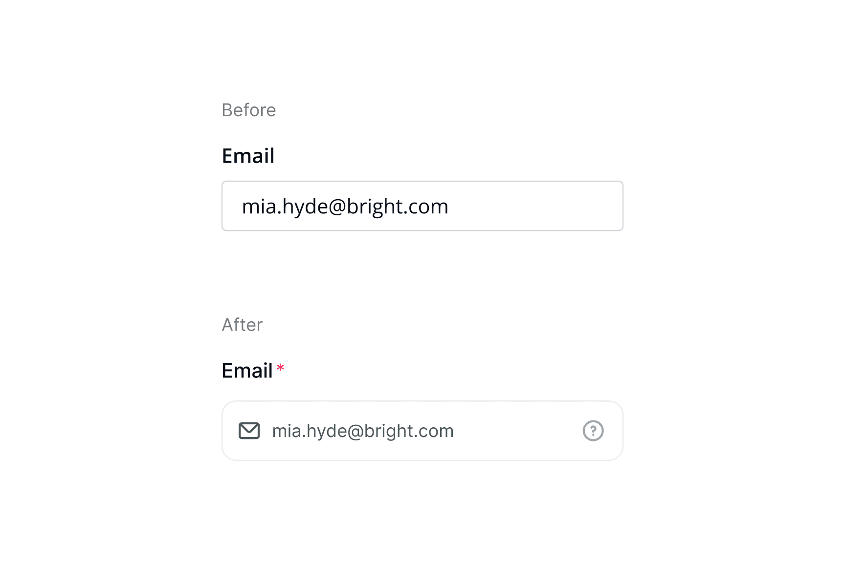
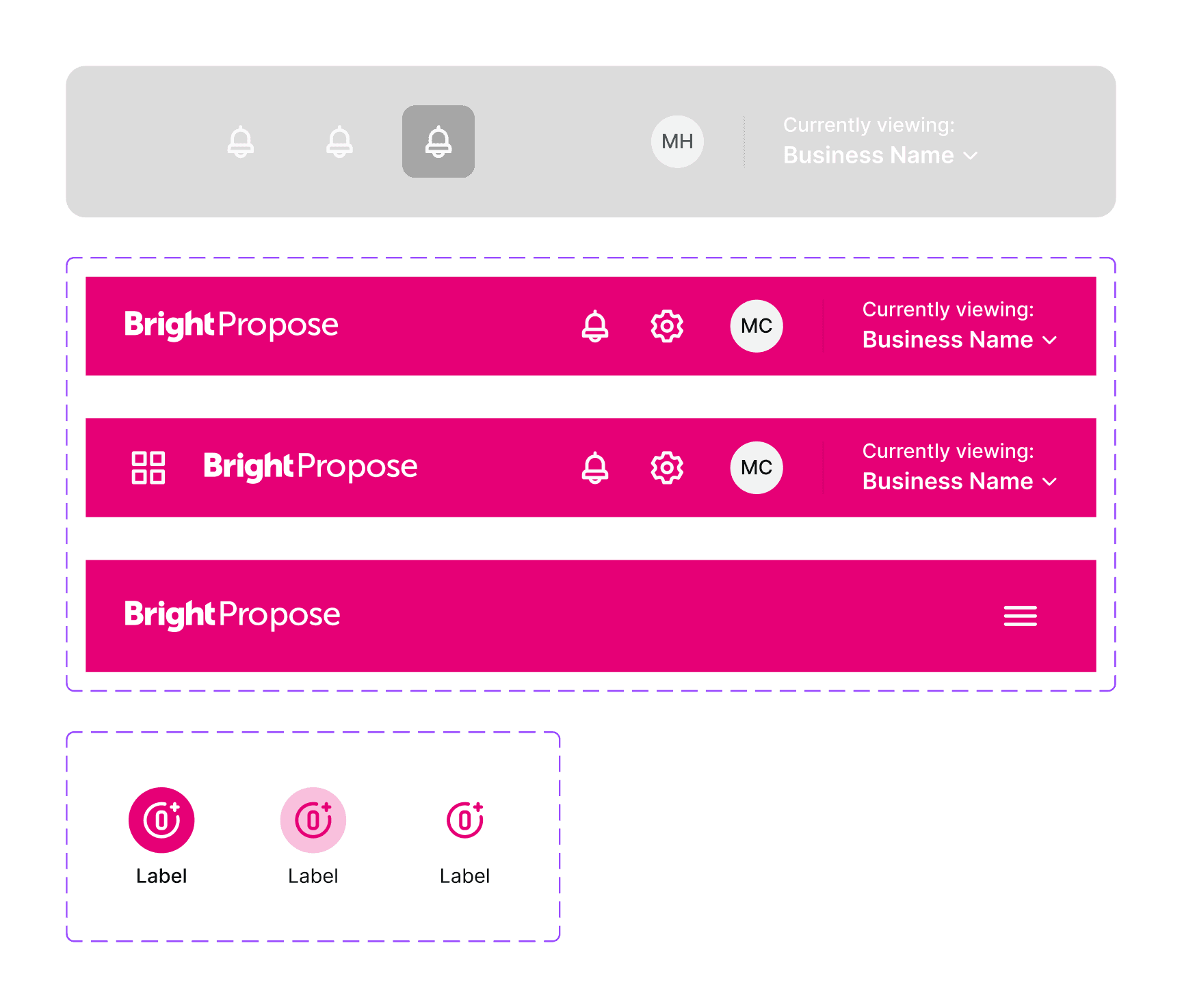
Reduction of variants
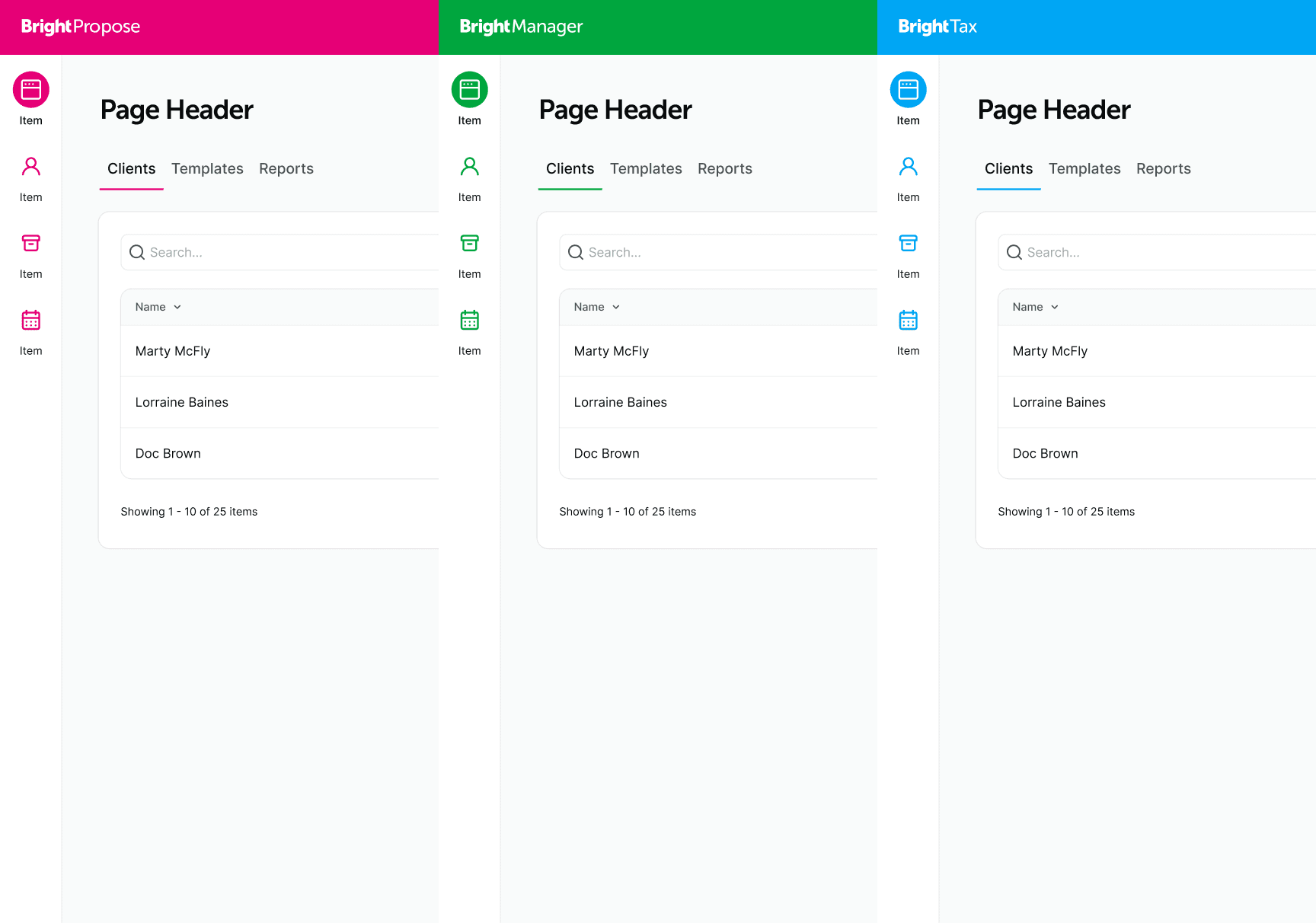
Part of the variable and token structuring, I created a product catalog using Figma Modes, allowing product theming to be set, changes and switched quickly and efficently without needed a group of variables per product.
By structuring the variables in this way, I was able to achieve a huge reduction in number of component variants for base layout components and header and navigation reduced from 130 components to just 8.
Product theming
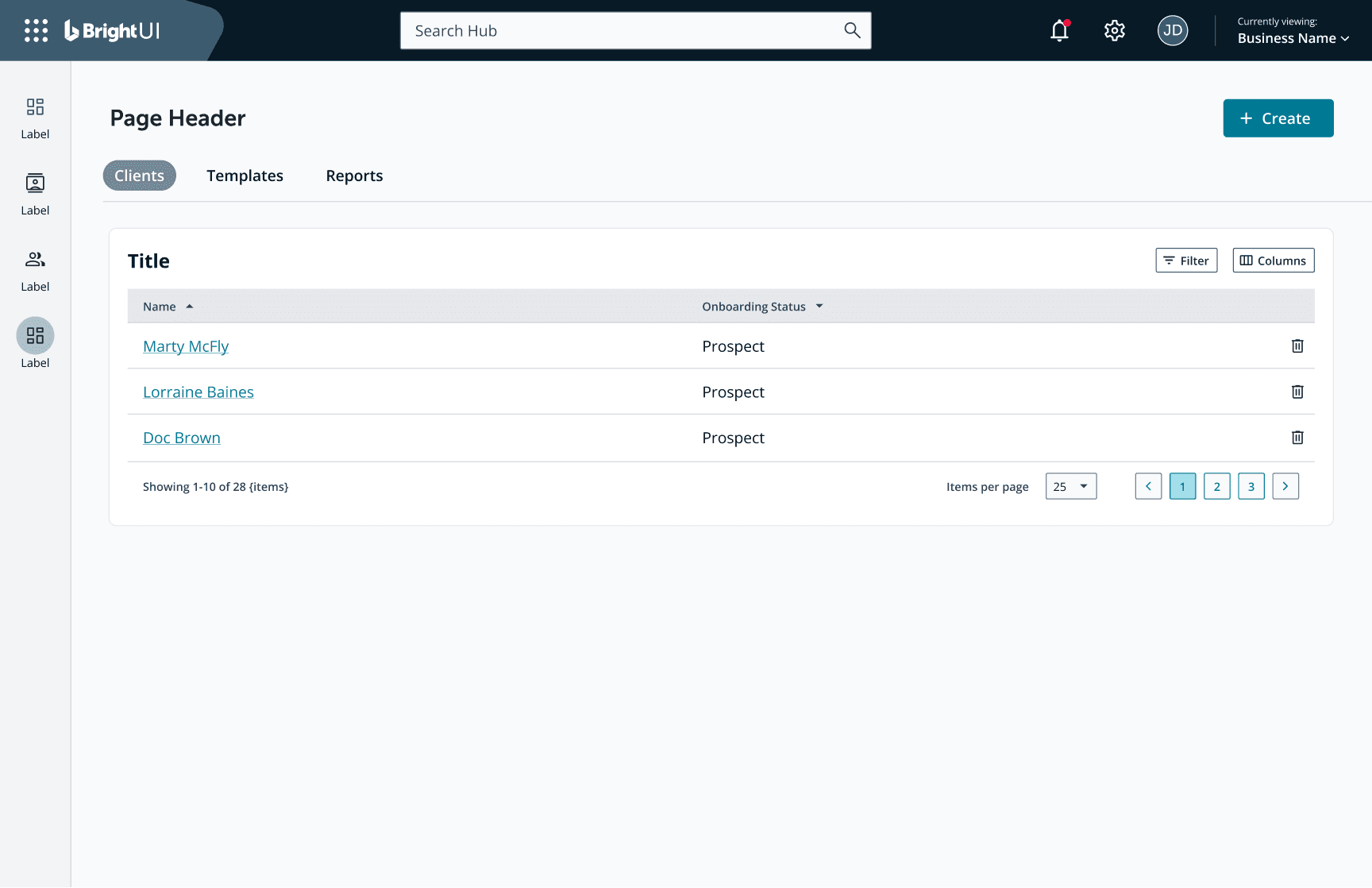
BrightUI2 uses a one-click theming system that allowed for product specific branding to be applied to the entire products core components without needing specific variants for each product, and dark-mode is already baked in.
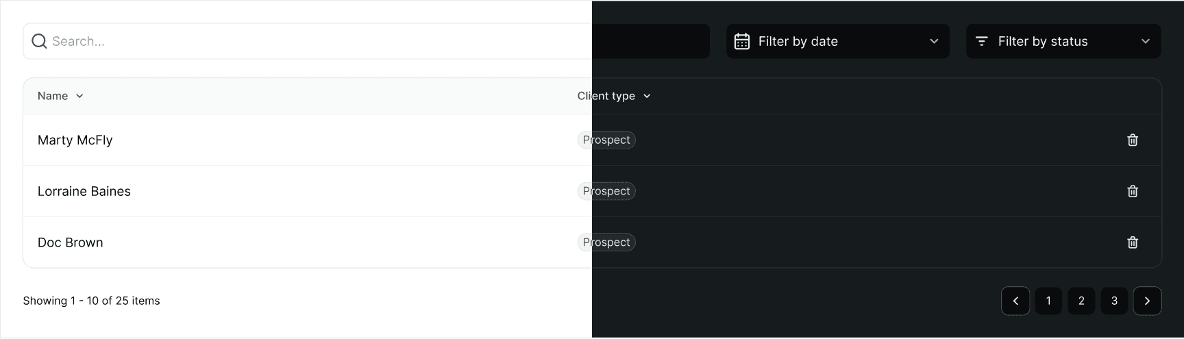
Dark mode
Dark mode wasn't an afterthought. I designed the system to be able to switch between light and dark mode with ease, and all components were designed to work in both modes without any additional work.
Governance
Crit-sesh
Proposed component changes were added to a dedicated section of the design template and brought to critique before acceptance. Engineering had visibility early feedback happened before implementation, not after. That single process change made the team more deliberate about what entered the system and significantly reduced unreviewed drift.
Branching and contribution
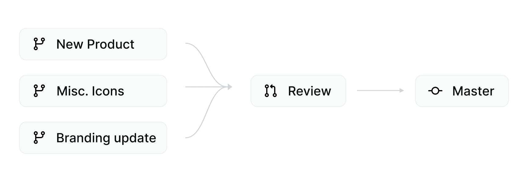
I implemented branching to establish a lightweight contribution workflow: designers could propose changes in isolation without touching the live system, and merges required review before landing in the main file. The same discipline as a code pull request, applied to design.
Documentation
While Storybook was being rebuilt, I created inline documentation in Figma to provide guidance on usage, constraints, and contribution standards, making it a living document to guide teams with how to use the system and how to contribute to it.
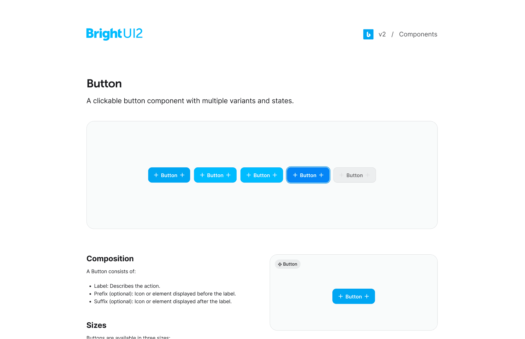
Leaveraging Figma's MCP and Claude Code, I created a simple documentation website, designed to be easy to navigate and search. It included all of the information from the Figma prototype, as well as additional information about the design system and design language. The website was designed to be a living document, and it was updated regularly as the design system evolved.
Reflection
The token architecture is the part I'm most proud of. What sounds like a process detail four variable collections, consistent naming conventions turned out to be the load-bearing element of everything else: theming, dark mode, multi-product support, and a design-to-code vocabulary that both design and engineering could adopt and actually maintain. Getting that architecture right before touching a single component made every subsequent decision easier.
Governance is not overhead it's what determines whether a well-built system stays well-built. Critique workflows, branching standards, and documentation aren't the interesting parts of a design system project, but they're the parts that matter most over time. A system without governance degrades; a system with governance compounds.
The decision to rebuild rather than patch was the right call, and it was worth making deliberately rather than reactively. Framing it to the team as building infrastructure that gives everyone more flexibility not starting over got the buy-in the project needed to succeed.